 Canvers Media
When Your Business Looks Exactly Like Every Competitor
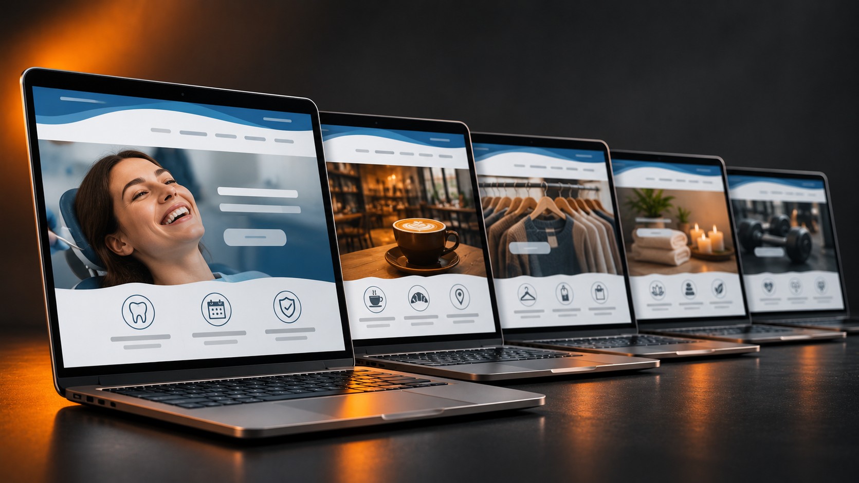
Pull up five dental clinics, five corner cafes, or five clothing shops in the same search result and look at their websites side by side. Same stock photo of someone laughing over coffee. Same tagline about quality and trust. Same blue-and-white color scheme. Same three service icons in a row. This is not a coincidence, it is a pattern, and it is quietly costing businesses customers at the exact moment those customers are ready to choose.
Where the sameness comes from
Most small business websites and profiles aren't built from scratch, they are built from a template someone else already used, or copied from whichever competitor currently ranks first. A cafe owner looks at the top result for coffee shop near me, likes the layout, and asks for something like that. A clinic hires an agency that already has a dozen nearly identical dental sites in its portfolio, each with the same hero image of a smiling patient. None of this is dishonest, it's just efficient, but efficiency at this stage produces sameness, and sameness is invisible to a customer trying to tell two options apart, which is part of why a business can stay busy but never actually grow.
What it costs you at the moment of choice
The real damage isn't aesthetic, it's decision-making. When a customer scans the Map Pack or scrolls past five near-identical Instagram grids, nothing gives them a reason to pick one business over another except price or whichever one sits closest to the top. That's exactly how good businesses end up competing on price without meaning to, discounting their way into options instead of standing out as the better one. Google Reviews make this worse too: five businesses with Great service, highly recommend and a five-star badge graphic tell a browsing customer nothing distinguishing at all.
- An About Us paragraph that could belong to any business in the category if you only swapped the city name
- A stock photo of a handshake, a laughing customer, or a storefront that fifty other businesses have also licensed
- The same copy-pasted reply, Thank you for your feedback, under every single review
- A tagline built from the same three words every competitor also uses: quality, trust, community
Finding what's actually different
The fix isn't a new color palette or a trendier font, it's specificity. Real photos of the actual shop, the actual staff, the actual product on the actual counter, not a stock image fifty other businesses in the same city are also using. Review replies that mention the specific thing a customer asked about, not a generic thank-you. A plain description of the exact process a service follows, instead of a vague promise of quality. None of this needs a big budget, but it does need a site built to show the real business rather than a template version of it, which is the actual difference good website design makes when it's used that way, not just made to look nice.
Related articles
 Branding
Why Customers Walk Past a Business That Is Doing Everything Right
Customers can sense a stale business before they read a single review. Here's why doing everything right on paper isn't always enough.
Read → Branding
 Basics: Looking Consistent Everywhere
Why small businesses look less trustworthy online, and the simple one-page brand kit that fixes mismatched logos, colors, and profiles.
Read → Marketing
 That Talks About the Business Instead of the Customer
Most small-business homepages and ads describe the company, not the customer's problem. Here is how to spot it and fix it.
Read →