 Canvers Media
Branding Basics: Looking Consistent Everywhere

A customer who sees three different versions of your logo in one week doesn't think you're creative. They think something is off, maybe even that two different businesses are using the same name by coincidence. That small doubt, built up across a dozen tiny inconsistencies nobody ever meant to create, is often the real reason a stranger scrolls past instead of calling.
What Customers Actually Notice
Nobody reads a brand guidelines document before buying a coffee. They notice when the bakery's Instagram logo is a pastel hand-drawn illustration, the pickup window sign is dark green block letters from a different decade, and the name on Google Maps is still the old business name from three owners ago. None of these mistakes are dramatic on their own, and the owner probably has a reasonable explanation for each one. Together, though, they make a business look smaller, newer, and less trustworthy than it actually is, and trust is usually the thing a stranger is deciding on in the first few seconds.
A One-Page Brand Kit Is Enough
Most small businesses don't need forty pages of brand guidelines, they need one page that any new employee, printer, or freelance designer can follow without asking questions. This same discipline is part of what makes a website look professional to a first-time visitor: the same logo, the same colors, the same tone showing up consistently from the homepage all the way to the contact form, rather than feeling like three different projects stitched together.
- One logo file, saved as both a square icon and a full horizontal version, in a folder everyone on the team can actually find
- Two brand colors plus one accent, written down as exact hex codes, not described as "the blue from the website"
- One font pairing, used the same way on the website, social posts, and anything that gets printed
- One short description of the business, copied word for word into the Google Business Profile, Instagram bio, and website footer
Where Consistency Breaks Down First
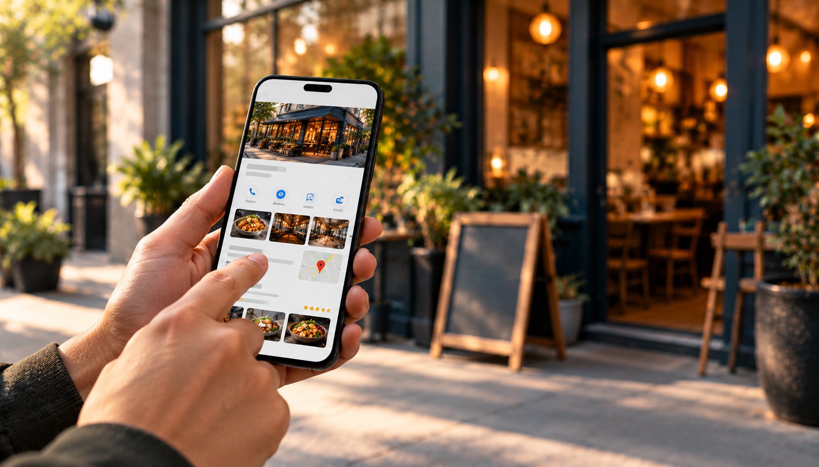
Google Business Profile is usually the weakest link, because owners redesign the website and refresh Instagram but forget that the profile still shows a blurry photo of the old storefront sign or a logo that hasn't been used in five years. That mismatch matters more than it seems, since for many local searches the Google Business Profile, not the website, is the first real impression a customer forms, which is part of why done-for-you Google Business Profile management exists as its own service rather than an afterthought. The same drift tends to show up on invoices, packaging, and email signatures too, places owners rarely think to check because they don't feel customer-facing, even though every one of them is seen by a customer at some point, and every mismatch is one more small reason to hesitate.
Related articles
 Local SEO
Done-for-you Google Business Profile Management: What It Includes
What's actually included in done-for-you Google Business Profile management for Toronto area businesses, from weekly posts to monthly reports.
Read → Strategy
When to White-Label Instead of Hiring Your Next Employee
Freelancers and small agencies: how white-label web and marketing work actually works, and what to check before you sign with a partner.
Read → Content
One Piece of Content, A Week of Posts
Stop hunting for new content daily. Learn how one video or photo shoot can become a full week of social posts, without feeling repetitive.
Read →